If you're looking for ideas for your winter family photo outfits, you're in the right spot.
Here are my 4 favorite WINTER COLOR PALETTES and OUTFIT TIPS for your family photo sessions. For the longest time, I didn't love the idea of telling my clients what to wear because I felt like it took away their personalities. But over the years as I've met with hundreds of families, I've learned a few things that can definitely help and not take away your uniqueness. I'm excited to share these with you!
Top Tips for Choosing Outfits:
- If you're feeling overwhelmed, you can narrow down one color palette to just 2 main colors plus neutrals.
- Neutrals are brown, black, beige, cream, grey, etc. Cream is always better than white in snow, IMO.
- These palette combinations below always look GREAT in snow and bright surroundings. Trust them!
- Muted or rich colors make all skin tones look great because there aren't any too bright or neon. Pick the one you like with your skin best and stick with neutral colors for accents.
- Steer toward one color palette and then bring your personalities in through texture, patterns, and style.
- Coordinate but DON'T match 💕 I thank you! Unless you walk around your day to day life in matching outfits with your entire family, why would you do it for photos? Ask yourself, 'How does each of my family members dress to look like themselves?'
- Lastly, dress warm. Wear layers you love and want to get photographed in. Give yourself permission to include coats and nice shoes in your outfit planning. You'll be so much happier with layers!


My 4 Favorite Color Palettes for Winter:
I always love when families dress how they're comfortable in ways that really FEEL like them. So my biggest goal is always to encourage that and help you feel like your personality is very present in all aspects of our photos together. But if you're struggling to put a cohesive vibe together, I am so happy to help out with these color palette ideas. These palettes go so well with the deep richness of the wood and pines that are visible in winter, as well as contrast really nicely with bright white snow. I love this time of year because people gravitate toward earthy, muted neutrals - and those colors make all skin tones look great and don't cast unwanted colors onto skin. It's a win for everyone!
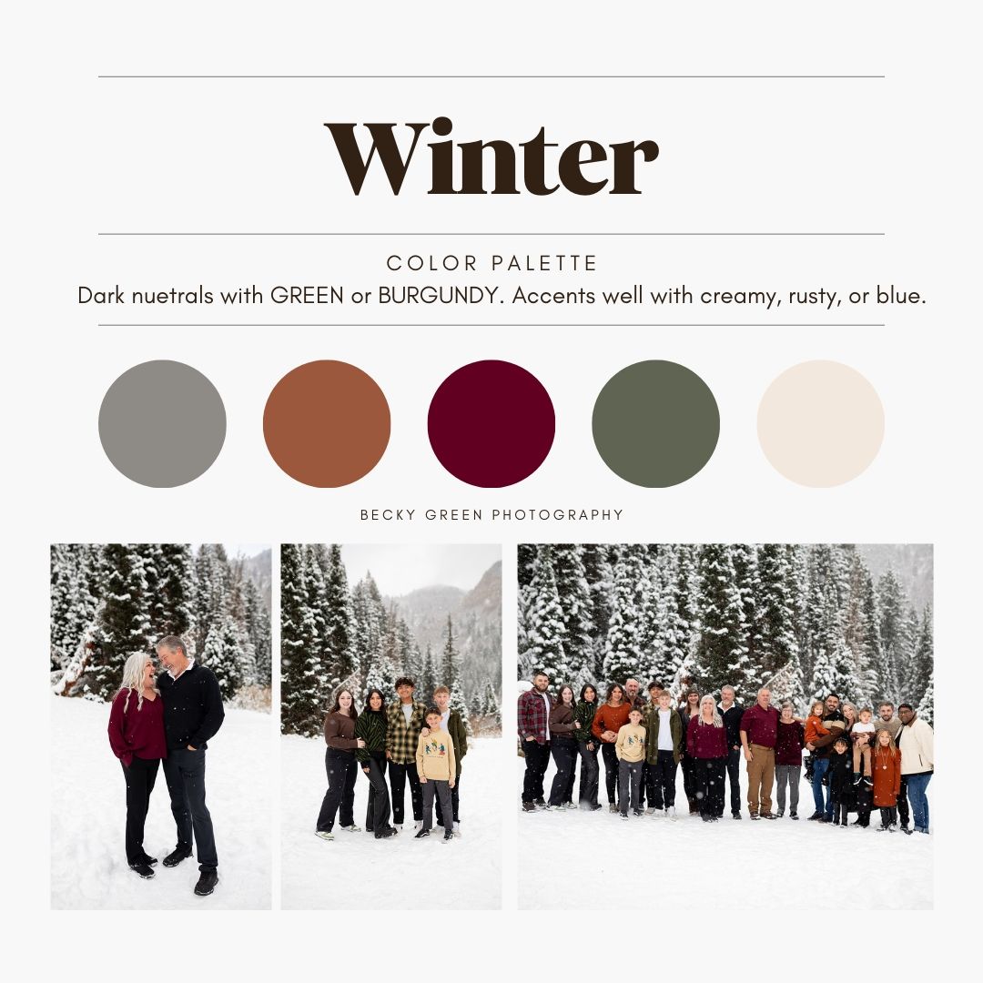
- Dark neutrals with GREEN or BURGUNDY.
- Dark neutrals with RUST, TERRA COTTA, TAN, and BROWN.
- Light neutrals with NAVY and CRANBERRY.
- JEWEL TONES.
1 . Dark neutrals with GREEN or BURGUNDY

This is one of the easiest color palettes to go with for winter for a few reasons. Everyone is guaranteed to have something to wear in one of these colors, so everything will feel easy and cohesive. It's also very reflective of the colors in nature during winter. The forest greens and burgundy bring out the deep greens in pine trees or trees that maintain berries. This palette converts nicely from holiday vibes to just winter vibes so is really versatile. You can focus on just green or just burgundy (or both), and accent with black, grey, tan, cream, or any neutral. So fun to mix and match with this palette!
2 . Dark neutrals with Rust, terra cotta, tan, and brown

This is probably my favorite of the color palettes! The browns, tans, and orangey terra cottas go really well with the deep blues of jeans. You're guaranteed to be able to accent these colors with beigey creams or deep blues any way you want. And a lot of people find it nice to only have to shop for tops and use their existing pants. It brings out the colors of plants that pop up out of the snow and makes your skin look warm even if it's cold outside. I find this color palette is nice to look at on walls mixed with home decor. It brings together the color of furniture wood and neutral textiles.
3 . Navy and cranberry with light neutrals

Navy and cranberry are quintessential winter colors to me. Bring in forest green and light neutrals like cream and beige - and you've got some classic, timeless colors you can be happy with all year. The crisp cranberry colors stand out against earthy tones and can be balanced out nicely with deep blue. The addition of navy blue keeps this from feeling too "Christmassy" with green and red. I always prefer cream or off white over pure white in the snow. I love how in this example, this family chose to accent this palette with a lighter blue. The balance is spot on.
4 . Jewel tones

To me, this is the fun, party palette of winter :) Depending on the type of clothes you wear, this palette can go playful OR classy. The rich colors can speak fancy gala or funky, quirky personalities. I love this palette because it's colorful without being neon, overly saturated, or wacky. I always prefer to photograph people in colors that don't make nature or skin look out of place. And jewel tones strike that balnce well.
Make sure to check out my other seasonal color palettes on the blog. And let me know if I can help!
I am always, ALWAYS happy to discuss putting together color palettes and coordinated outfits. I am the voice of reason encouraging you to keep it stress-free and personal, no matter the season.
I'd love to work with your family!
Please contact me to book your family session! To view more of my work, follow me on Instagram.